ask the expert: Adding color
Want to add color but don’t know where to start? We’ve got you covered!

I think it can be said that everyone still loves white! White walls, white cabinets, white tile, white siding… WHITE everywhere. And trust me I get it and share the obsession. But I also love to add color!
It’s funny when I speak to my clients who either purchase a pre-white everything home or have dug themselves into an all-white frenzy, they continually ask… What can I add that will go well with the current design situation. At first the question seems odd however it can be extremely overwhelming to know which design direction to go towards.


My first intuition is black. White and black has been a trend for countless years. So, in my eyes the safe approach. But like white, black is not a color, it’s a shade. So, let’s push that envelope and get you feeling excited about adding color into your home!

The first question I ask my clients is, do you like warm or cool tones?
Looking at a color wheel, typically warm tones are orange, yellow and red. While cool tones are green, blue, and purple. However, in the design field blue is typically viewed as a cool tone and green warm.
For a simple analogy let’s talk about paint. In the world of paint, you have true color tone, which is the color your eye sees and undertones, the color you don’t see. Undertones alter the hue to change the color to a warm or cool tone.
Keeping this in mind is very important when selecting finishes and furnishings. Even though mixing the two can interject some personality a good rule to follow is to stay in one lane for all fixed materials. For example flooring and wall tile. And having more fun with decorative items like throw pillows and floor rugs.
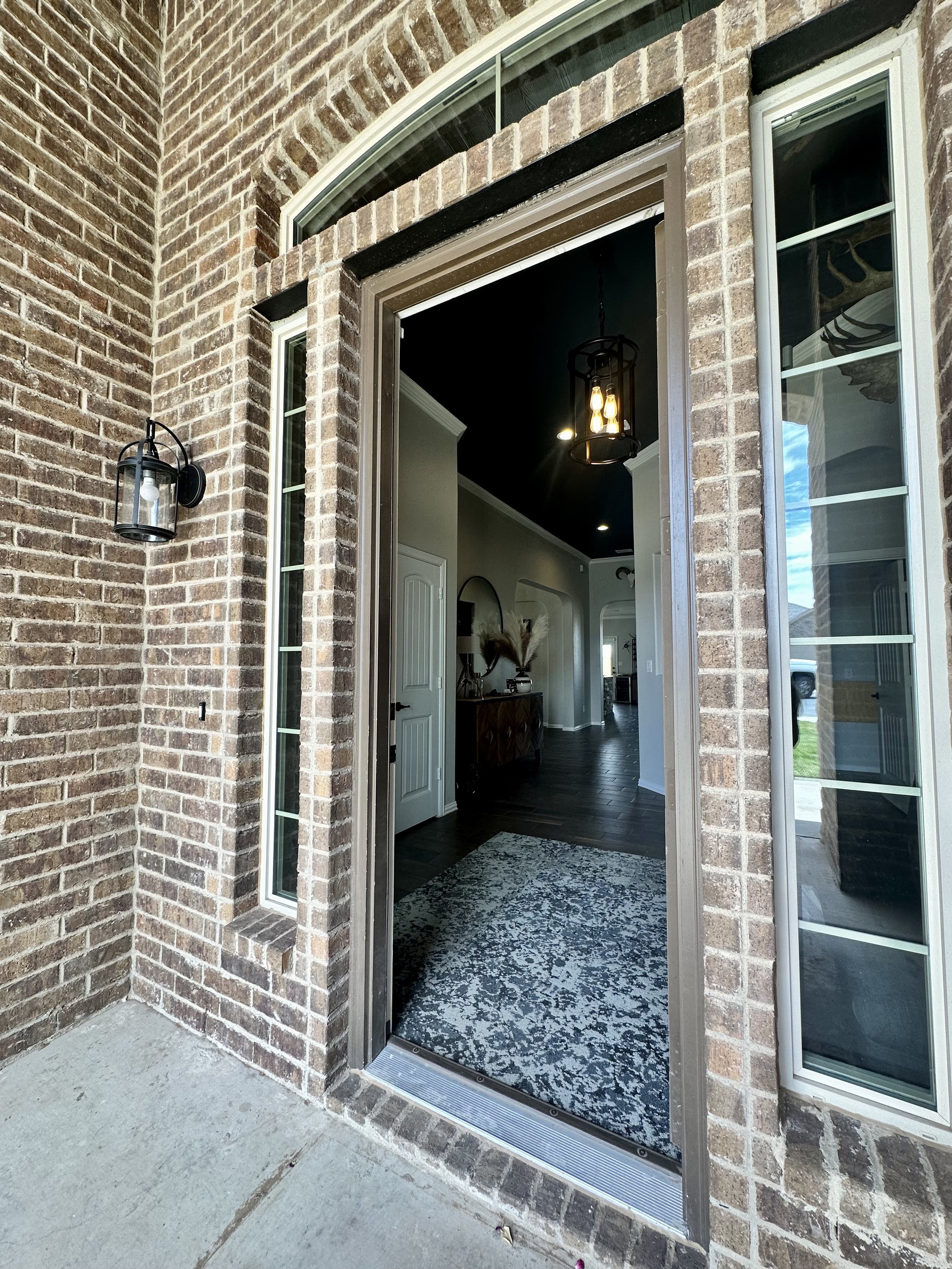
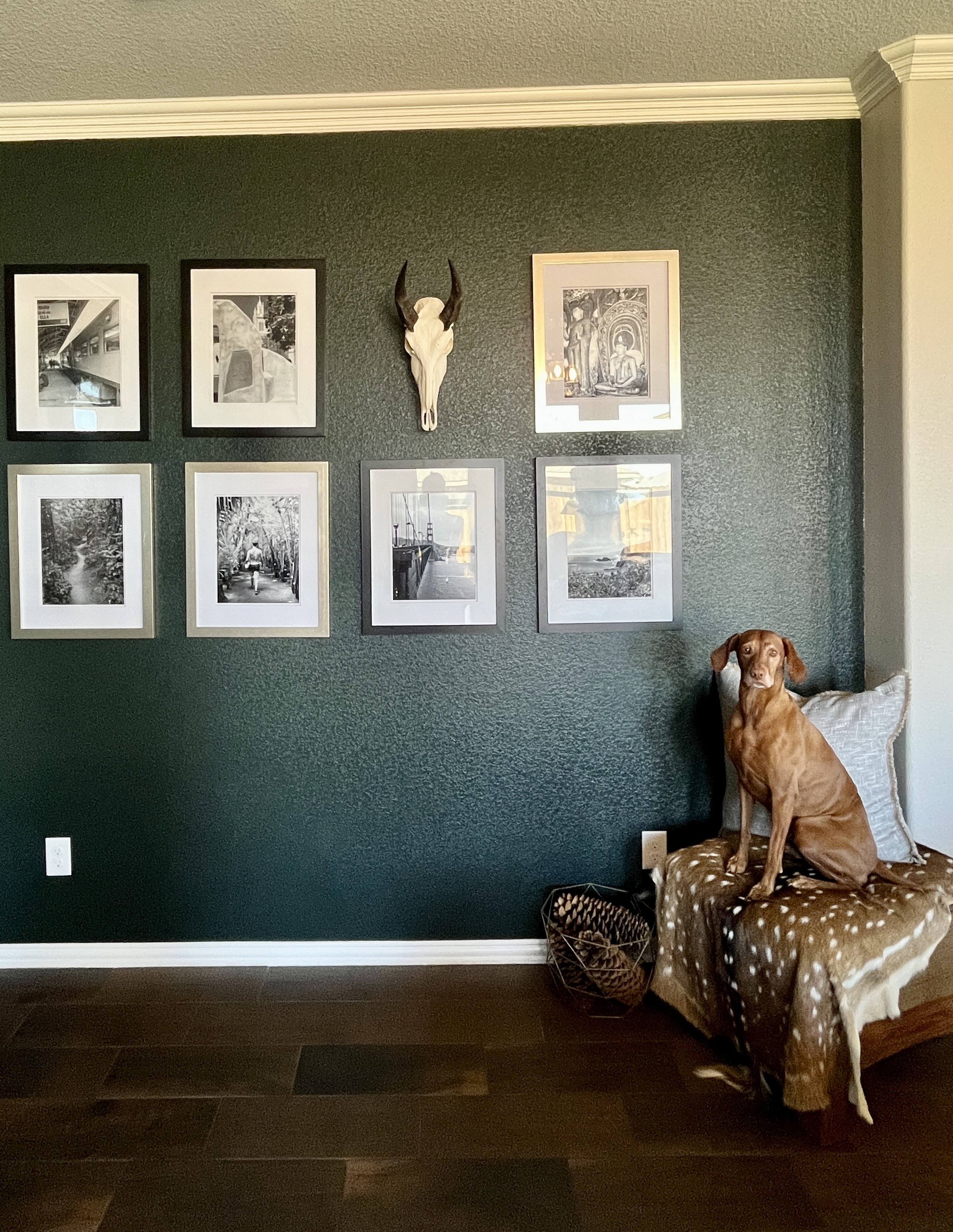
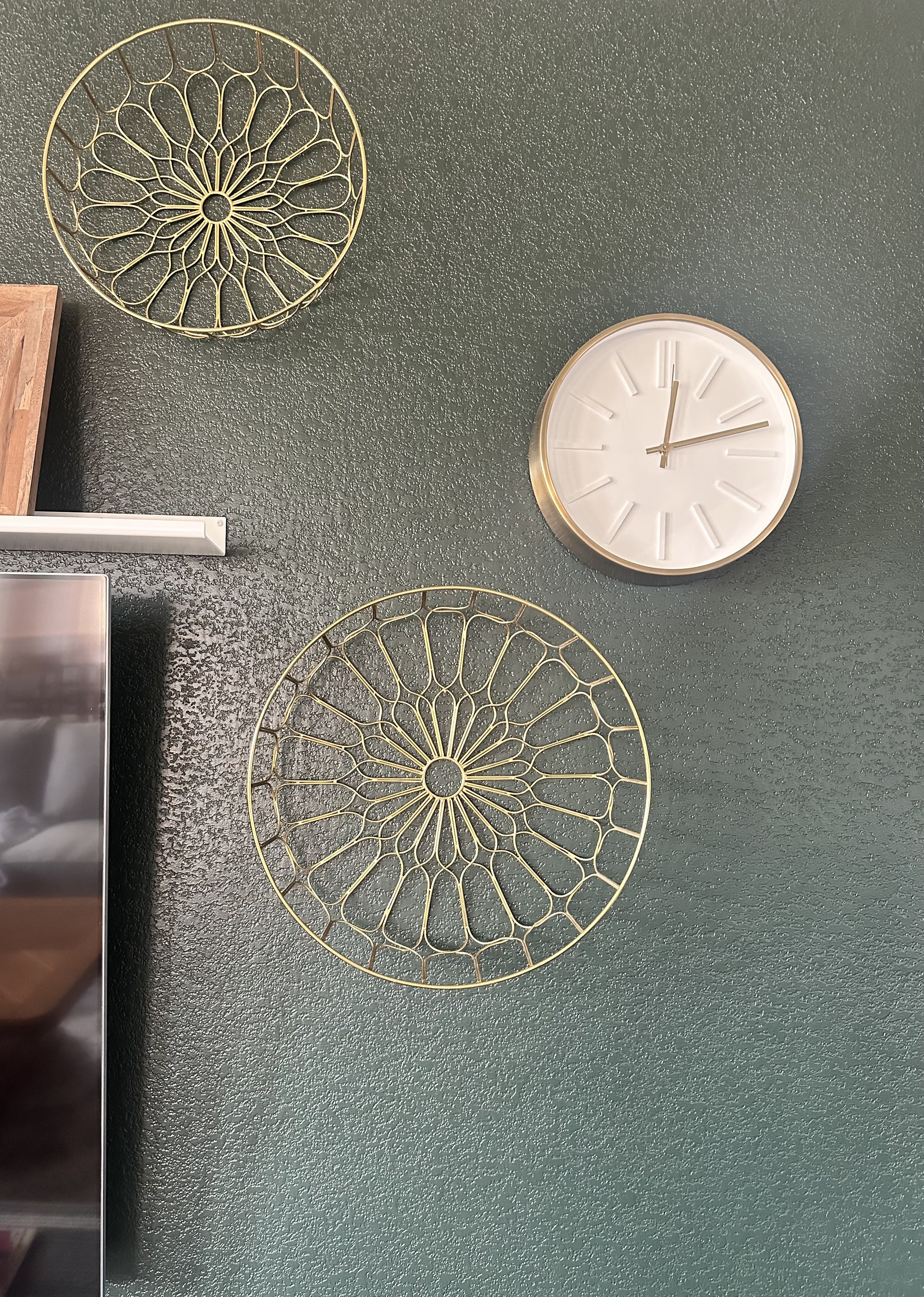
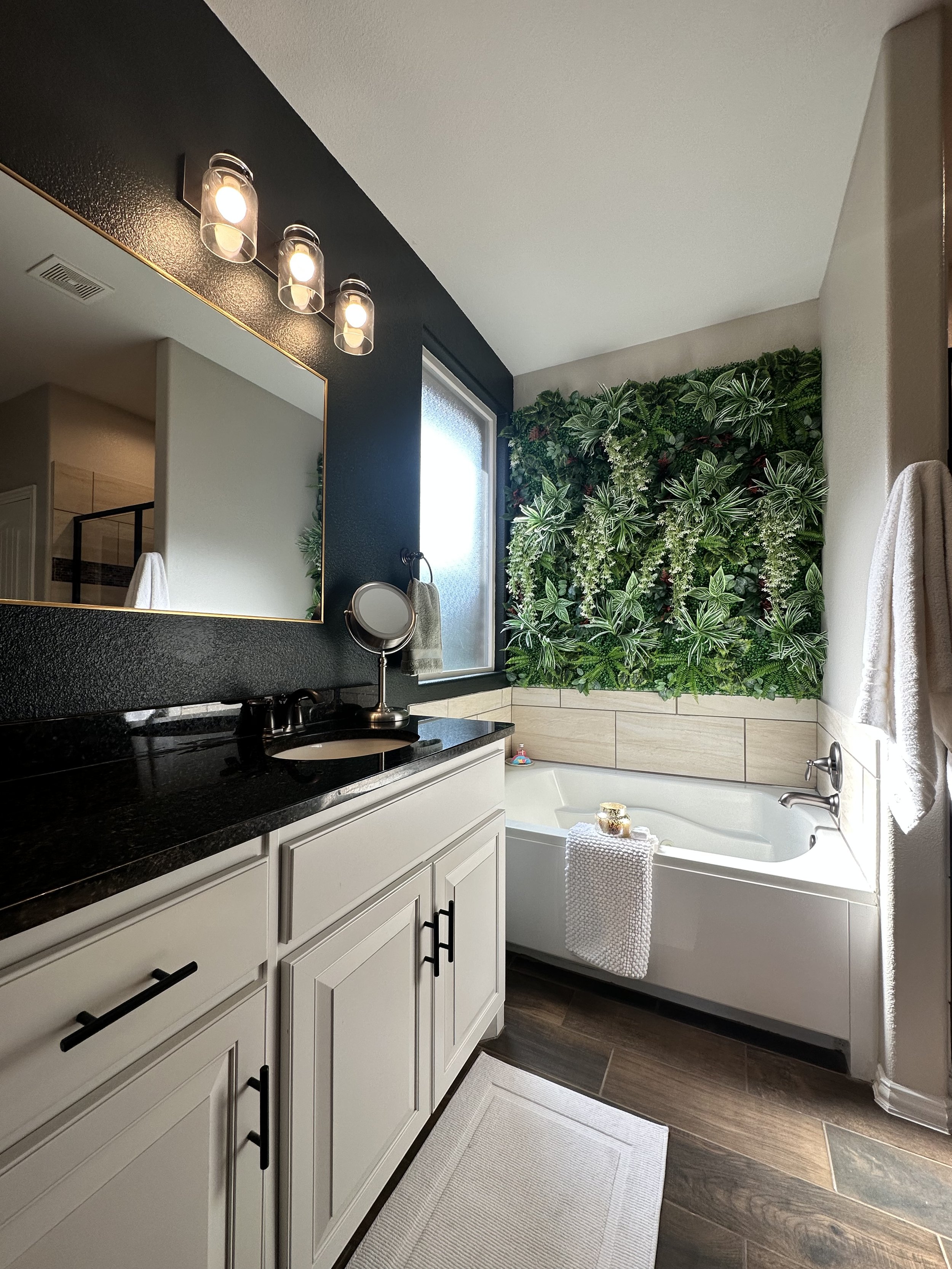
For existing spaces, this might already be determined. It is important to keep true to the materials that you will not be altering. Even though I tend to gravitate to a cooler palette I am not going to add it into our current home that has warm wood floors and antique brick. Instead, I selected a deep green (Sherwin Williams Jasper) and warm black (SW Iron Ore) as the accent colors and ran with it. Accessory finishes being gold and/or bronze rather than silver tones.
![IMG_E3772[1].JPG](https://images.squarespace-cdn.com/content/v1/641ca3f864c821572dd6ceeb/1683221129325-FMWDTLPA5RNO8NS1C9VC/IMG_E3772%5B1%5D.JPG)
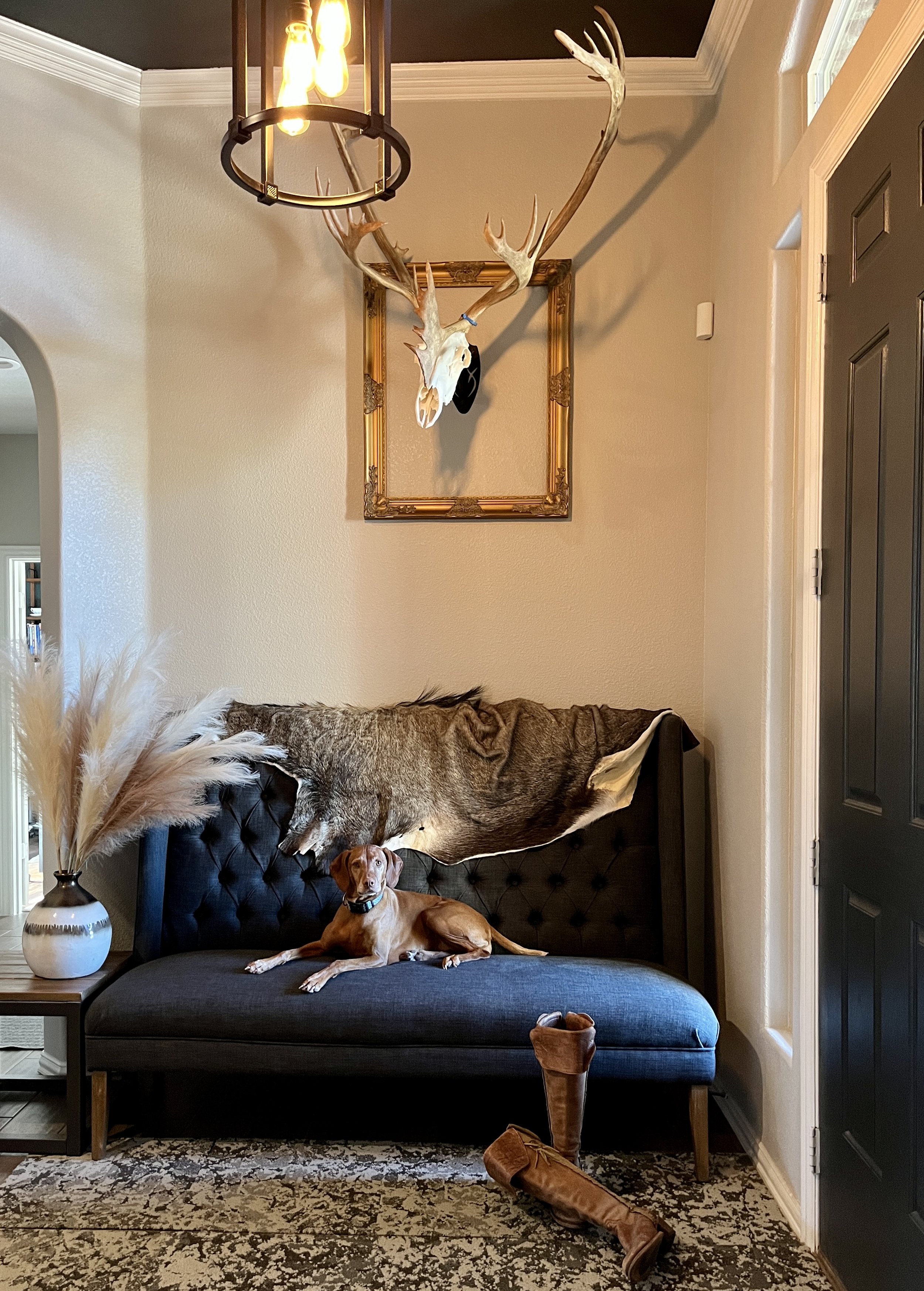
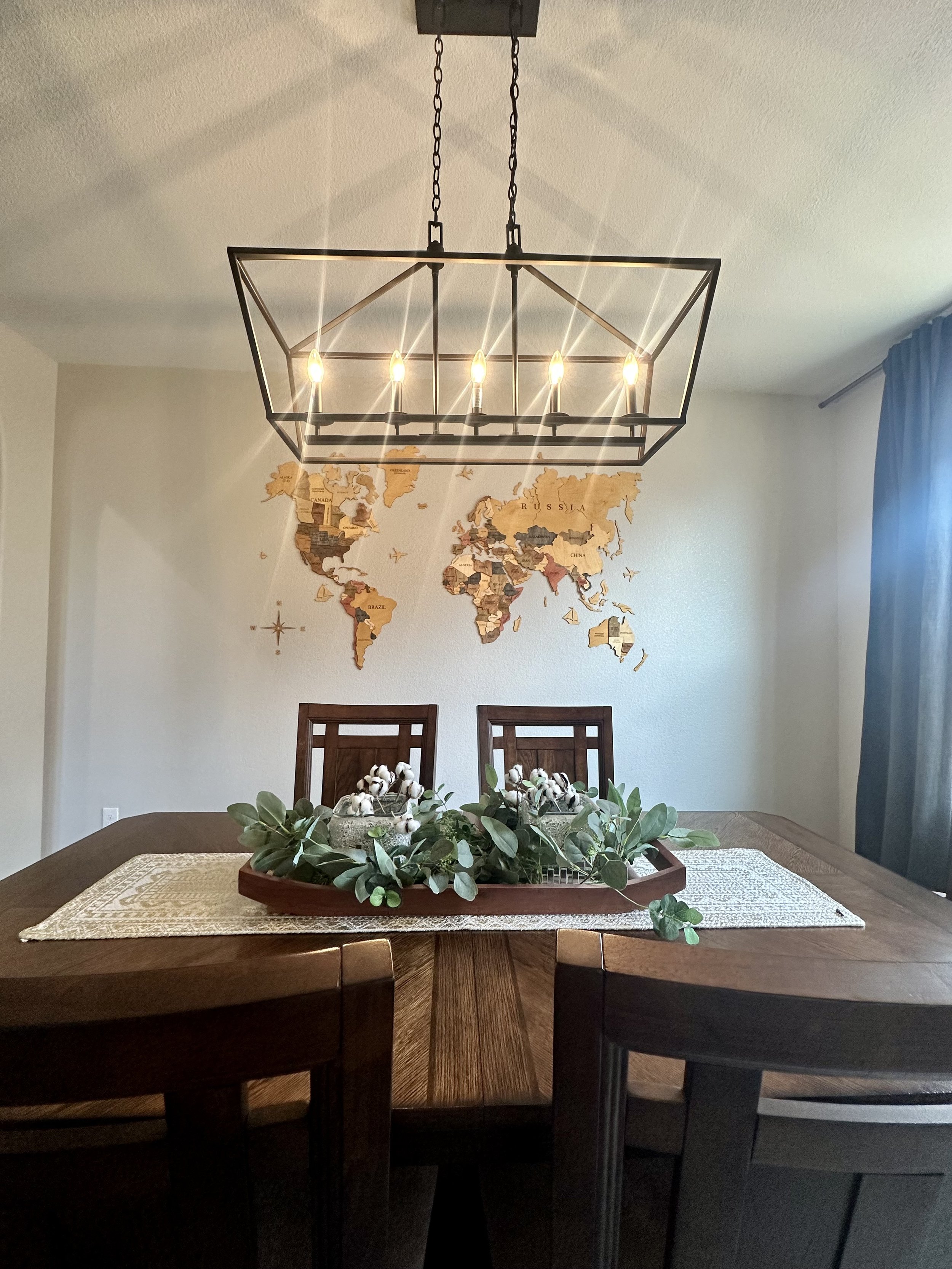
Warm wood furniture pieces include walnut, hickory, and oak rather than maple, poplar or ash. All these warm colors sit against white cabinets, predominantly off-white walls, and other white accents. Blending them all together is simple once you know if you lean towards a cool or warm palette.
If you would prefer to "dip a toe” into the color pool start with unfixed decorative items. Bedding, curtains, floor rug and throw pillows are an easy swap out. Also, paint! Paint is a powerful tool! And typically an easy weekend project or affordable to hire out.
I hope this is helpful and encourages you to try adding color into your home! Trust me you will not regret it!